Tiger’s Promise Cover Art
April 30, 2014
Tiger’s Promise Cover Art Featuring Artist Cliff Nielsen!
Before I get started on this post I just want to say that working with Cliff on this project has been an absolutely wonderful experience, and the fact that he’s taking time out of his busy schedule to answer a few questions and talk about cover art with me, which is a subject that is near and dear to every reader’s heart, including mine, shows what a fantastic guy he really is. Check these out walkerstgallery .
Here’s his bio:
CLIFF NIELSEN
Cliff Nielsen is best known for his work on projects such as Star Wars, The X-Files, Chronicles of Narnia among many projects including advertising camaigns, designs, and magazines. He studied in both traditional and digital illustration and graduated as valedictorian from Art Center College of Design in CA. His illustrations have been recognized for their excellence by the Society of Illustrators, Print, and Spectrum among others. Feature articles focusing on his work appear in design publications and fanzine magazines alike. Cliff has been an international speaker on digital art and has served as a judge for the Society of Illustrators and a variety of professional illustration award programs. He lives and dreams in Los Angeles, California.
Cliff Nielsen Interview
Here are the answers to some questions I’ve long been wondering about cover art.
Colleen: How did you get started in the business of doing cover art?
Cliff: I’ve been interested in books and comic books since I was a boy. I got in trouble in 7th grade for reading Edgar Rice Burroughs “John Carter Warlord of Mars” instead of doing my classwork. The story was great, but the covers created by Frank Frazetta are what really captured my imagination. They were a little racy and the puritanical teacher thought I was filling my head with some age inappropriate material. I won’t bore you with the details, but it all got sorted out by the principal, who happened to be a Tarzan fan.
I grew up in Idaho, in a very rural community and didn’t realize you could make a living as an artist until I met my first mentor, Leon Parson at the age of 18. He is an amazing wildlife artist, and he put me on the right path. He started by humbling me up a bit, (I needed it) and then pointed me in the right direction in terms of education. I eventually moved to Los Angeles California and graduated from Art Center College of Design in Pasadena. That experience help me break into the field of illustration, and I’ve been busy ever since.
Colleen: What other YA authors/covers have you worked on?
Cliff: So, so many. I have been very very lucky. Currently the covers for Cassandra Clare’s Mortal Instruments series have been getting a lot of attention.
Colleen: Which book in the tiger series was your favorite to design?
Cliff: Tiger’s Promise has been particularly rewarding, but Tiger’s Curse was also a pleasure, because it was the first.
Colleen: Where did you get the idea for turning Yesubai upside down in Tiger’s Promise?
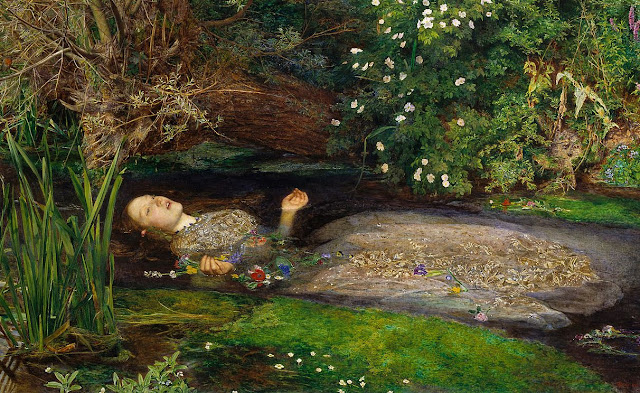
Cliff: Colleen had made some great suggestions for the cover, and I just extrapolated out on her ideas a little bit. I have always loved John Everett Millais’ “Ophelia,” so that image was certainly an inspiration.
Is Yesubai’s image reflected in the water as she peers down at the lily from above, or is she under the water staring at us through the shallows? Could she be one with the water? When you read the book, the truth of the image reveals itself.
Colleen: How do you choose the elements you will put in your design?
Cliff: Typically I get a synopsis of the story, or even better, a manuscript of the book. I quickly read it and then start searching for the meaning, and what symbols (mentioned in the book or otherwise) can be used to most efficiently communicate that idea. Oftentimes the main character and the setting of the book needs to be portrayed. Creating a good composition is a constant balancing act. I have to give enough information to the reader to hook them into opening the book and suggesting what kind of trip they are about to embark on, but I also have to be careful not to spoil the resolution of the story.
Colleen: If I wanted to be a cover artist, how would I go about getting started? And do you need a college degree?
Cliff: It’s a very rare talent that can skip the training you would get from a great art school and still be a success in this field. Don’t overlook the key words from that statement… “great art school.” Not every university program is the same.
A great art school is like a time machine that crushes 20 years of art creating experience into 4. It provides a safe environment to experiment and test your skills. It also gives you a chance to network and become friends with other like minded individuals, it introduces you to internship possibilities, does career counseling and job placement in the industry. It teaches you how to find the answers to the questions that have not yet been asked.
I know I couldn’t have the career I have without my college degree.
Colleen: Can you talk about the symbols behind the art in Tiger’s Promise?
Cliff: There are many, but one thing that I’d like to touch on briefly is Yesubai’s gaze. When we see her upside down, her eyes look intense and fierce like a wild animal, and the jagged edge of the lily looks like the teeth of a monster. If you flip the image and look at her face to face, the petals of the lily now become the suggestion of a crown, a slight smile appears on her face through the veil, she becomes intelligent confident and beautiful.
Colleen: Does your vision ever conflict with the publisher’s and if so, how do you deal with that as an artist who relies on creativity to do your work?
Cliff: Certainly my ideas about what the cover ought to portray sometimes differ from the creative team at the publishing house. Even the author will have different ideas about what the cover could look like.
I will propose my ideas alongside their own suggestions in the form of a sketch and make the best case for it. But as a professional, I have to abide by their decisions and deliver the very best image possible.
Colleen: What makes a book cover stand out on the shelf?
Cliff: If you have one second to look at the cover and the image sticks in your mind chances are it will stand out on the shelf, but there are so many factors to consider. What if all the books on the shelf are green, and only one of them is red? What if they are all the same size, but just one is taller? Publishers are constantly vying for the reader’s attention, and that is why you see so much variety in the market and why popular books are redesigned every so often.
Colleen: Leonardo Da Vinci said, “Art is never finished, only abandoned.” Do you agree?
Cliff: Yes! The deadline rules your life as a freelance illustrator. The double edged sword of the creative process is that there is no singular “correct” way to communicate the idea of your art. You could spend a lifetime chasing the false idea of a perfect solution, and never complete a single piece of art.
Colleen: How much feedback do you usually get from authors and do you get free copies of the book when it’s done?
Cliff: This cover was special to me because I had the pleasure to work with Colleen directly. Not only is she a great author, but she strikes me as a very visual person, and that made it especially fun. That being said, I do not often get feedback from authors. The publishers hire many specialists to market and promote the book, and I typically answer directly to them. Editors, Creative Directors, Art Directors, Marketing Directors Illustrators and sometimes Animators are all focused on bringing as much attention to the authors ideas as possible.
When I first started my career, I had a dream that I would create a bookshelf in my studio that contained at least one of every cover I created. I’m still working on that goal. It’s easier when I get a copy of the book from the publisher, but sometimes the publisher forgets to send one and I have to chase it down in the bookstores. The cashiers sometimes wonder why I’m so interested in YA fiction.
Colleen: Why do publishers redesign book covers from time to time, like the Narnia series you did?
Cliff: It’s simply an issue of marketing. When you change your wardrobe (do you see what I did there) people take notice of you with a fresh eye. That reminds previous readers how much they enjoyed the story, and hopefully visually connects with a new younger audience. I realize that someday many of my titles will become nostalgic and also need to be updated, but that is the nature of pop culture.
Colleen: What work have you done so far that you’d most like to be remembered for?
Cliff: Other than my work with the Tiger’s Curse series I have created nearly 2000 images since I started my career.
Among them are:
The Chronicles of Narnia
X-Files
Wrinkle in Time
Mortal Instruments
Star Wars
Star Trek
but my best work, I hope, is yet to come.
Thanks so much Cliff for answering those questions! I think he has a fascinating job and he’s just so very talented. Thanks for taking the time.
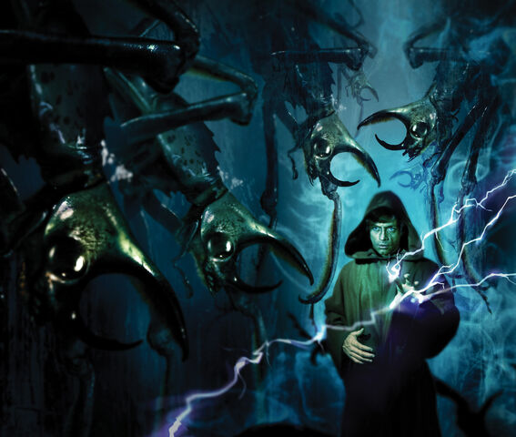
Here are a few of his oh so very pretty covers.


He’s amazing, isn’t he? I feel very honored that he took time to do this with me.
If you’d like to follow Cliff, he has a Facebook page and his portfolio can be found at Shannon Associates.
_________________________________
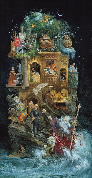
For me as the author, I have some pretty specific ideas about what I want my cover art to look like. I’m a huge fan of an artist named James Christensen. Not only is his art wild and whimsical but there are little hidden gems found in each picture. This piece below is called “Shakespearean Fantasy.”

I like art that tells a story and I especially enjoy pieces that I have to go back and look at time and again and every time I do, I find something new. This is one of the reasons I like Cliff’s work so much. Every cover he’s done has those little nuances, sometimes subtle, that give more insight into the story he’s designing for.
Now let’s talk about
TIGER’S PROMISE
When I write a story the setting is very important to me. I love deep jungles, gorgeous scenic vistas, rich colors, and wild landscapes. This is where my characters live, love, and grow. The backdrop for Yesubai’s story is no less important so I’m very happy that when I look at the cover I feel transported not only to India but to the India of Yesubai’s lifetime.
SYMBOLS:
PURPLE LOTUS FLOWER: In TIGER’S PROMISE, Yesubai is lovely but she hides behind her beauty and sees it as more of a trap than a blessing. One symbol I chose for her is a very special lotus flower with the same color as her eyes. Through it, I wanted to show how unique Yesubai is but also how fragile and how easily she could be crushed beneath her father’s bootheel.
SPARKLING DUST: This is a symbol of Yesubai’s magic, a gift she inherited from her father though he is unaware of it.
KOI FISH: In the book Kishan tells Yesubai a story about koi fish. There is a legend that says that very determined koi who swim up the Yellow River in China and manage to make it to the top of a waterfall are granted a gift of the gods. They become dragons. Yesubai takes this story to heart and it drives her in a way, fueling her courage.
WATER: In the cover image Yesubai is seen as a reflection in the water. Cliff came up with this idea on his own but I think it’s genius. Water is sustaining, cleansing, and fluid. It adapts to its environment. This is what Yesubai has done. She has molded herself into the person her father wishes her to be and yet not even he can contain her. She seeks to cleanse herself of her father’s blood and become someone new.
HER EYES: Since eyes are the window of the soul, Yesubai’s eyes are very important. Looking at her upside down is a bit jarring, but it’s meant to be that way. When you look at her straight on, you can see the alarm and the panic in her eyes but if you turn the image upside down, all you can see is the beautiful girl she shows to the world. In this way you as the reader can actually discern the truth that she so carefully hides.
THE VEIL: I knew when I began writing that veils would be important. Veils are still very prominent in Indian culture. They’re mysterious and beautiful just like Yesubai. Yesubai uses them as a protective barrier. She hides behind them and the times when she is found without them or when they are draped over her arms are the times when she is at her most vulnerable. Lokesh insists that she wear them which is likely a way for him to avoid guilt, for when he looks into the face of his daughter he sees her mother who he strangled on the day of Yesubai’s birth.
DEATH: Yesubai looks as if she’s floating there in the water and the image reminds me of Ophelia from Shakespeare’s Hamlet. Like Ophelia, Yesubai was young, beautiful, and had a potentially full life of happiness to live, but it was not meant to be.
There, on the pendent boughs her coronet weeds
Clambering to hang, an envious sliver broke;
When down her weedy trophies and herself
Fell in the weeping brook. Her clothes spread wide;
And, mermaid-like, awhile they bore her up:
Which time she chanted snatches of old tunes;
William Shakespeare, Hamlet Act IV Scene VII

PINSPIRATION:
Here are some of the pins that inspired the cover.

I think her eyes here are lovely and the pond is perfect. Yesubai has long flowing hair like that as well.
This image inspired her jewelry and her hair.

This image inspired the koi becoming dragons.

This image inspired Yesubai’s lotus flower.

This was my main cover idea. I wanted to show a beautiful mysterious girl wrapped in veils with only her eyes visible. In this image you aren’t sure if she’s alive or dead.
To see the rest of the images that inspired TIGER’S PROMISE, head over to my pinterest board.
THE DESIGN
Once I turned over all these ideas to Cliff, that’s when concept became art. It started out with Cliff sending me some sketches.
Here’s his original description of what the cover would look like.
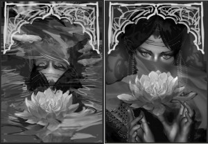
“Here the beautiful Yesubai is featured in either composition, hair adorned with delicate gold chains and a flowing veil that covers her face except for her alluring violet eyes.
The composition on the left is a reflection of her in a pond with a lotus flower in full bloom floating on the surface. Just below the ripples of the pond we notice koi swimming near the top of the composition. I like this one a little better.
The composition on the right is more straight forward and reads a little quicker. It is a stunning portrait, again of Yesubai, holding delicately a lotus flower.
In terms of color, either composition should incorporate lots of purple and greenish blue hues, and of course I will create a paisley design that will incorporate the graphic shape of the koi fish and blend it into the image as a semi-transparent layer.”
As you can see. Both options were beautiful but I ultimately decided to go with Cliff’s suggestion and chose the image reflected in the pond.
Now as a special prize Cliff has created a beautiful Yesubai 11 x 17 poster that we are both signing for a giveaway. Enter the rafflecopter here for your chance to win this gorgeous poster and a signed copy of Tiger’s Promise!
This entry was posted in Contest, Tiger's Promise.
Categories
- A Guy's Perspective
- Articles
- Beauty
- Bonus Material
- Colleen Houck Book Club
- Conferences
- Contest
- Contest Winners
- Crafts
- Events
- Exclusive
- Fans
- Featuring Authors
- Grandma's Review
- Holidays
- International Books
- Kelsey's Favorite Things
- Kid's Perspective
- Life Events
- Marketing
- Marketing
- Movie
- Movie Review
- Mr. Kadam's Spice Kitchen
- Mythology
- News
- Puzzle
- Quizzes & Games
- Reawakened
- Recipes
- Recreated
- Reignited
- Reunited
- Shows
- store
- Terraformer
- The Lantern's Ember
- The Modern Ink Society
- Tiger's Curse
- Tiger's Destiny
- Tiger's Dream
- Tiger's Promise
- Tiger's Quest
- Tiger's Tale
- Tiger's Voyage
- Top Ten Lists
- Travel
- Uncategorized
- Upcoming YA Books
- Valentine's Day
- Video
- Writing Advice
- Writing Fun
- Writing Tools
- YA Scavenger Hunt
Archive
- November 2020
- September 2020
- July 2020
- June 2020
- May 2020
- April 2020
- March 2020
- October 2019
- September 2019
- June 2019
- May 2019
- April 2019
- March 2019
- January 2019
- December 2018
- November 2018
- October 2018
- September 2018
- August 2018
- July 2018
- May 2018
- April 2018
- March 2018
- February 2018
- January 2018
- December 2017
- October 2017
- September 2017
- August 2017
- July 2017
- June 2017
- May 2017
- April 2017
- March 2017
- February 2017
- January 2017
- December 2016
- November 2016
- October 2016
- September 2016
- August 2016
- July 2016
- June 2016
- May 2016
- April 2016
- March 2016
- February 2016
- January 2016
- December 2015
- November 2015
- October 2015
- September 2015
- August 2015
- July 2015
- June 2015
- May 2015
- April 2015
- March 2015
- February 2015
- January 2015
- December 2014
- November 2014
- October 2014
- September 2014
- August 2014
- July 2014
- June 2014
- May 2014
- April 2014
- March 2014
- February 2014
- January 2014
- May 2013
- November 2010
- October 2010
- August 2010
- June 2010
- May 2010
- March 2010


